
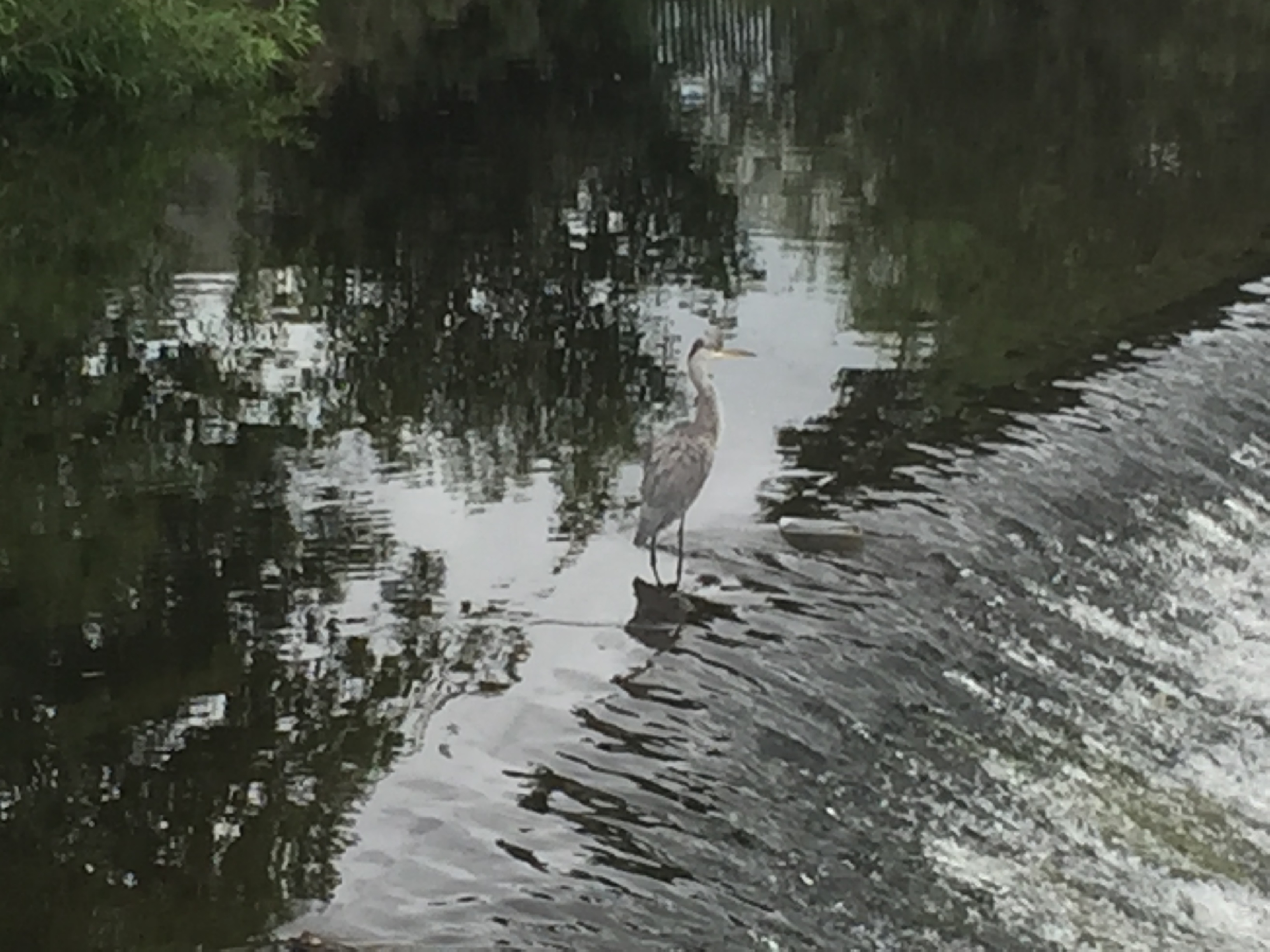
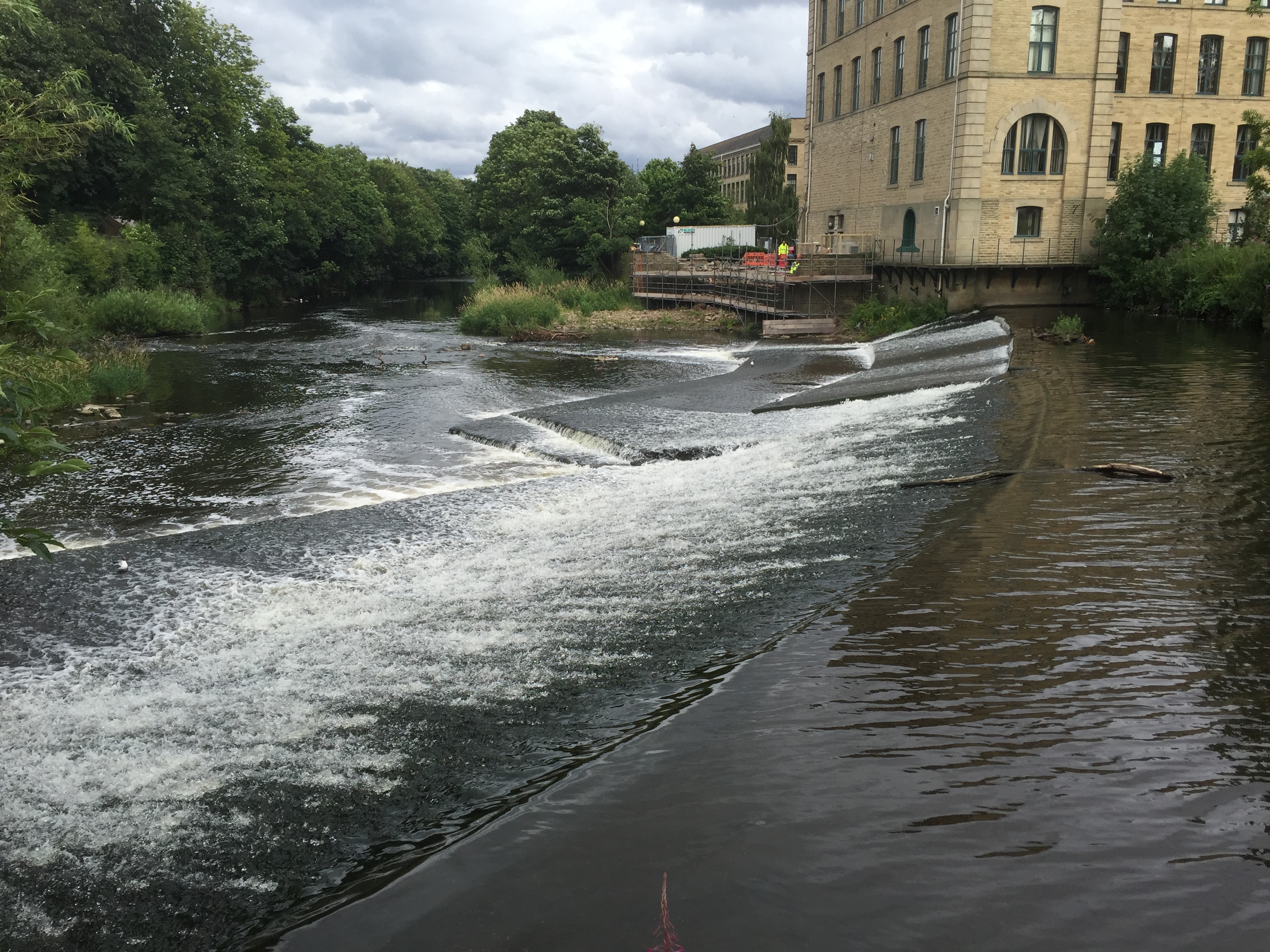
 Yesterday I was back down at Shipley weir, immediately downstream of Baildon Bridge, to visit my old friend the heron (above), and to show around a colleague of mine at Manchester University, Andrea Bottacin Busolin. Andrea (male, pronounced the Italian way, because he’s Italian) is a civil engineer who very kindly took some time out to analyse some flow data for the River Aire (which was, in turn, kindly supplied by the Environment Agency). This investigation was in response to a question raised by Phillip Moncaster, of Baildon Woodbottom Working Men’s Club (just upstream of the bridge). Put simply, if this weir was taken out of the river, might this reduce flood risk to the club and other local homes and businesses? Phillip’s hypothesis (discussed in more detail in this previous blog post) was that taking the weir out might lower the flow level of the water going under Baildon Bridge — meaning that in high water conditions the bridge would not so quickly turn into a concrete dam across the river…
This always seemed a reasonable hypothesis, but we needed to look at what the technical evidence for it might or might not be. And in practice, it seems, the data does not support the hypothesis. The bridge is a problem, yes, but taking the weir out won’t really help. Here’s why…
First: If you click on this link, it should open up a summary graph of the technical data. Don’t ask me to explain what it all means, because I’m not an engineer, but basically this is a representation of the downhill flow of the River Aire – moving from left to right across the page. The section analysed here starts somewhere near Crossflatts, and stops somewhere downstream of Woodhouse Bridge. It shows “river bed elevation” (that is, the level of the river bed) in relation to the “water surface profile” (the level of the water in different flow conditions).
Now, you can clearly see where Andrea has marked Shipley weir (aka Baildon weir) on the summary graph. It shows up as a small spike in the downhill flow. And if you look just to the left of that marker, you see two other spikes… Together, these three little spikes, roughly in the middle of the graph, represent the three weirs in the Shipley area — Hirst weir, Saltaire weir, and then Shipley weir. Now, watch what happens to those three spikes in this animation of the flow data as the water gets higher and then lower again…
(OK, yes, I added a little free music to it via YouTube, to try and make it a bit more exciting.)
As you can see, as the water level gets higher, the weir spikes gradually cease to affect the surface level of the water. The water gets so high that the weirs basically disappear from view. And this happens fastest with Shipley weir — so fast, in fact, that the weir quite quickly ceases to make much difference to the flow level. Saltaire weir takes a bit longer to disappear below the waves — and interestingly it seems that Hirst weir continues to make a bit of a difference even in very high flows. This explains the roiling wave effect that eye-witnesses saw at Hirst weir during the height of the flooding.
Now, based on this same data, Andrea was also able to provide a hypothetical animation of what would happen to the flow if you were to take out Shipley weir. He simply removes that third spike from the graph, and then animates the same flow data. This is what you get (again with dubious musical accompaniment…):
As you can see, the pattern is almost identical to that in the first animation… demonstrating that in practical terms, the presence of Shipley weir makes almost no difference at all to the behaviour of the river during high flows and flood conditions. It’s really only in low flows that the weir makes a marked difference to the river’s upstream and downstream levels.
Now, Andrea was the first to acknowledge that the accuracy of this judgement is dependent on the accuracy of the data that he was given. And the Environment Agency is in the process of updating its survey analysis of the Aire as we speak. But there’s no particular reason to doubt his broad conclusions. I invited him down to Shipley yesterday simply so that he could see the weir itself, in situ (rather than as an abstract set of data) and so that he could meet Phillip. We had a good chat, which concluded aptly with Phillip’s wry observation that: “I guess we need to think of something else then.”
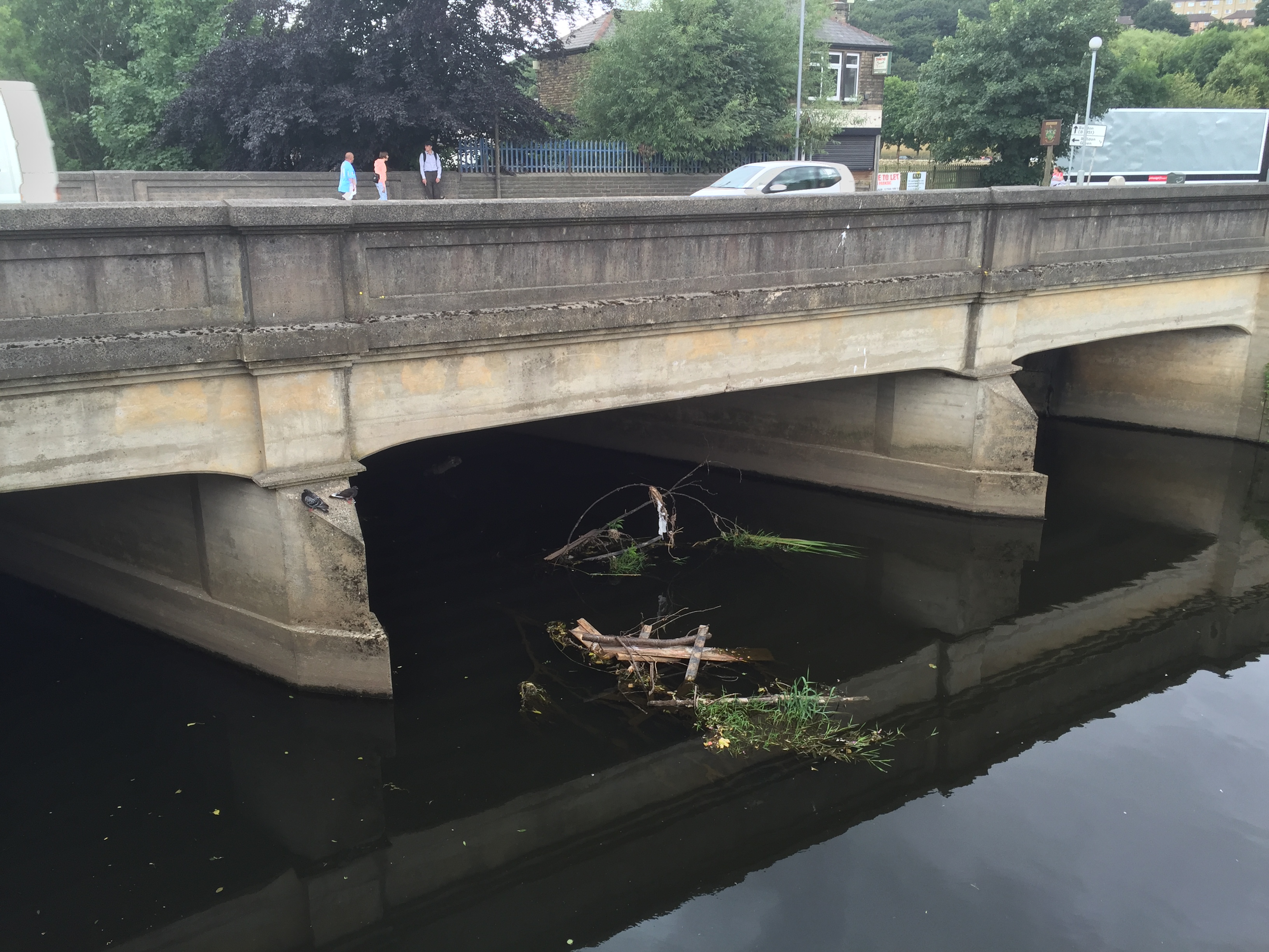
We noted rather grimly that there’s a lot of debris in the river again, especially around the bridge, just waiting to contribute to damming problems in high water conditions. And there was more of this to be seen as Andrea and I walked upstream to from Shipley weir towards Saltaire weir, using the riverside path. Look at this by the pipe aqueduct just upstream of Phillip’s club…
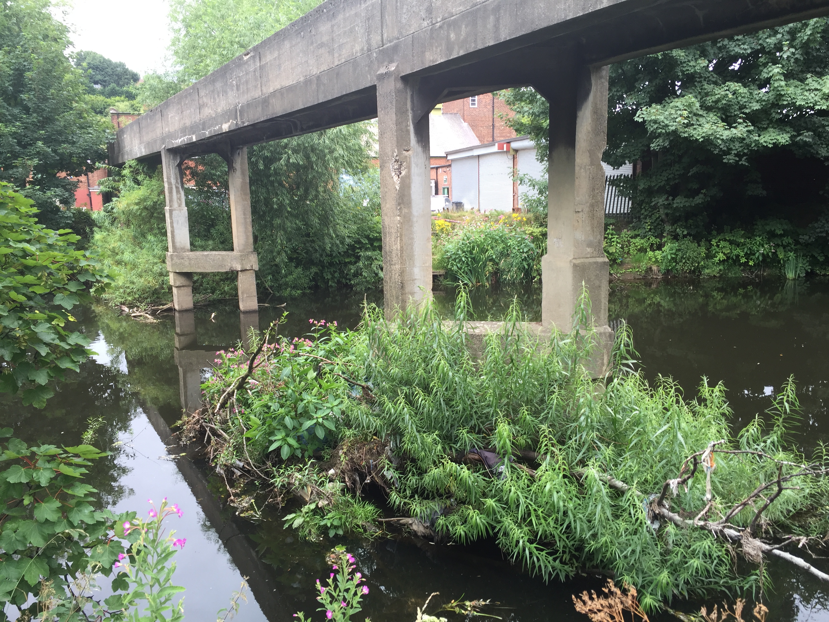 And then of course there’s the flood debris from last time, still very much apparent in the riverside trees….
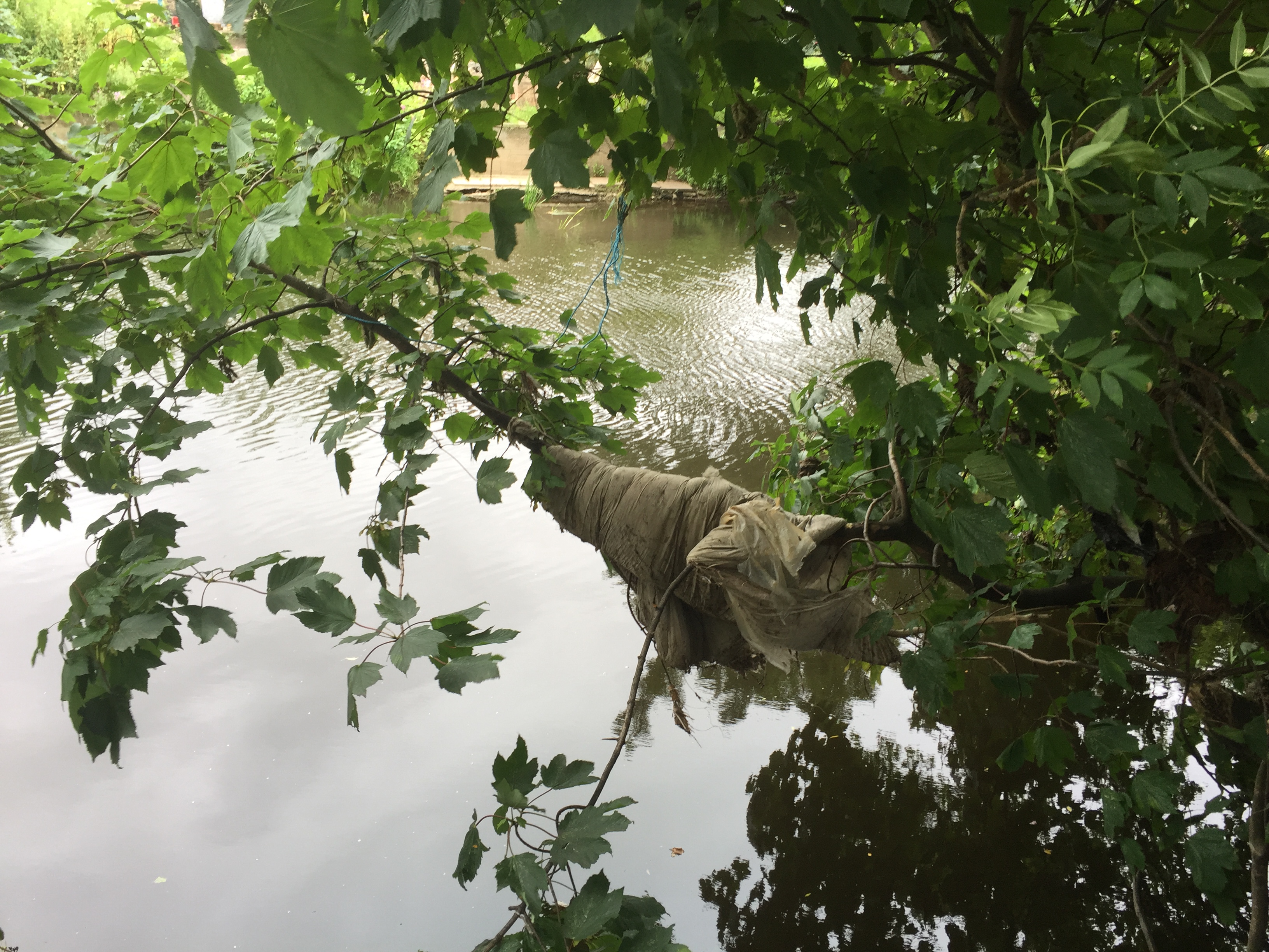 Indeed, Andrea was intrigued to notice the amount of “lateral vegetation” along the river banks — by which he means the trees and shrubs that grow right out into the river, and catch hold of rubbish like this in high water. Vegetation like this, he noted, will provide some resistance to water flow which is difficult to represent in the simple graphs. It will be interesting to see if the EA’s new data set starts to take this kind of close-up detail into account, although – again – it probably won’t affect the broad conclusions about the weir.
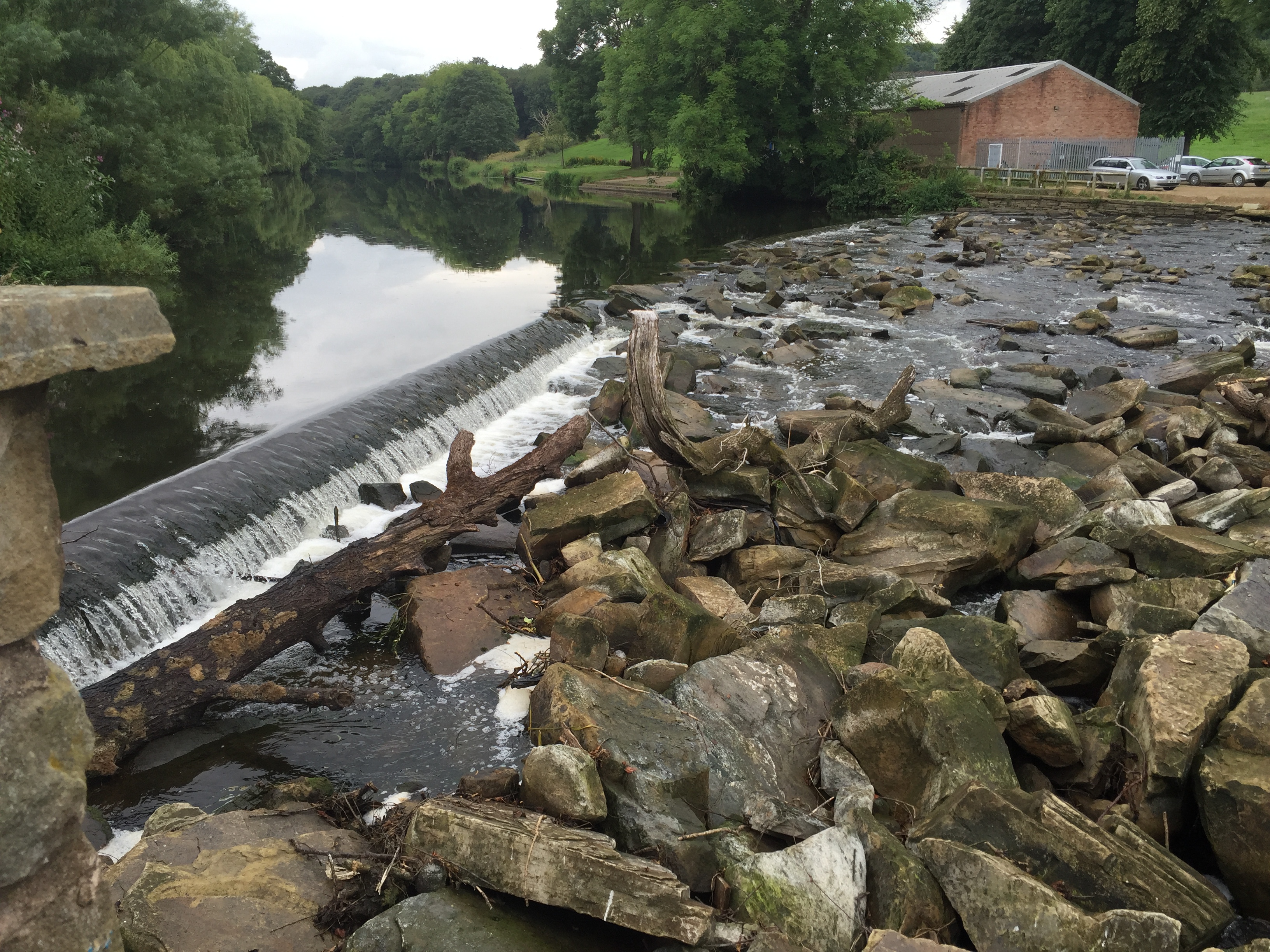
Reaching Saltaire and its weir, its particularly apparent just how low the flow in the river is just now — enabling you to see the entire structural architecture of the weir…
We didn’t walk up as far as Hirst weir (pictured below from a visit the day before), but perhaps the most significant finding of Andrea’s technical analysis is just how much of a role Hirst weir continues to play in relative flow levels, even in high water. This is relevant to the continuing debate about whether the Rowing Club’s repair of that weir has adequately addressed the downstream flood risk issues associated with it.
Just for the record, here is Andrea’s slightly more technical summary of what his analysis shows:
“The graph summarises the results from the simulation of a 10 year flood under two different scenarios, with and without weir. I have also included a plot of the upstream flow hydrograph (discharge versus time) representing the boundary condition at the upstream section. You can see that the water surface elevation just upstream of the weir is different for the base flow at the beginning of the simulation, but the difference disappears as the flow discharge increases. The maximum water surface level for the simulated flood event is virtually the same for both scenarios. This means that the weir has no significant effect on the water level during high flows. However, the local flow contraction induced by the weir produces higher flow velocities just above the weir and higher turbulence intensity downstream of it, thereby increasing the risk of local erosion. This may not represent a significantly higher threat if the river bed and banks are sufficiently stable.”